 The first thing people see when they walk into a space? COLOUR.
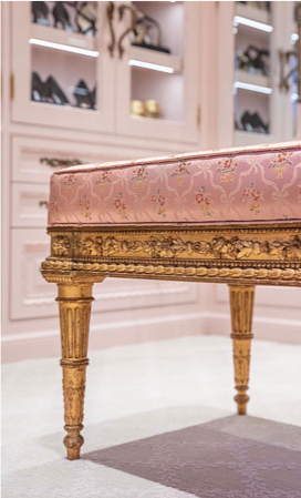
I was really excited to learn what this year’s Benjamin Moore Colour of the Year was, and I am not disappointed. Turns out that this stunning blushy pink is not just for the nursery anymore, which is SUCH a delight. This is one of my favorite shades to play around with in different spaces.
The colour is First Light 2102-70, which makes for stunning accent walls, for plush pillows, or even a specialty cabinet – or a decked out walk in closet with all the regal details to boot, like in the features photo! The possibilities are endless as long as you let your imagination run wild.
This little statement from Andrea Magno, the Benjamin Moore Director of Colour Marketing and Development, says it all:
“We selected First Light 2102-70 as our Colour of the Year 2020 to represent a new dawn of idealism, design, and living. [It] reflects a new definition of the home – a shift in mindset from the material to satisfying the core needs in life: community, comfort, security, self-expression, authenticity and ultimately, optimism.”

 If you thought that was all, it’s just the beginning. The runner ups for this colour are equally as zen and à la mode as it gets.
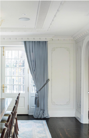
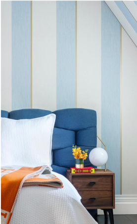
The cool blue gray of Windmill Wings encapsulates that late fall mood we feel settling into our (blush pink!) pillows with a hot beverage. Its use in these two photos are stark – you can isolate the colour for a moody focal point that stands out, or surround yourself with this colour that feels like a getaway to an oasis!

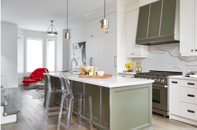
The subtle elegance of Cushing Green here adds a pop of colour to any space, and it really ties into the indoor plant craze that’s going around – and no complaints here! The use of green in this kitchen is a nice touch, and is enough to make anyone who comes over feel relaxed!
Colour can be divisive, but I think the general consensus will be that there’s something here for everybody! It’s a wide spectrum if there ever was just one, so it’s nice to see some colours capture the spotlight.

